
DashboardRenewable energy
Greenbyte
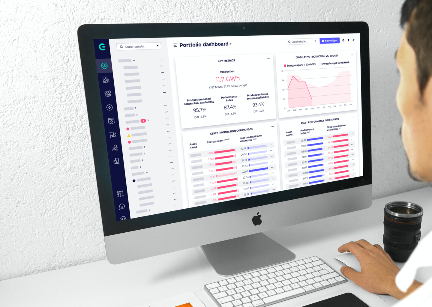
A dashboard experience for renewable energy operations, focused on making complex performance data easier to read and act on.
Role
UX / UI designer
Focus
Dashboard UX, data visualization, workflows
Output
Operational screens and style guide patterns
Context
Renewable energy management
Problem
Energy teams need to monitor output, weather, equipment status, reports, and alerts without drowning in operational detail. The product had grown organically and needed clearer navigation and consistency.
Contribution
- Improved data visualization so energy output, weather, and equipment status could be understood at a glance.
- Refined navigation and workflows for checking performance, investigating alerts, and generating reports.
- Introduced UI consistency for buttons, charts, forms, and dashboard modules.
Outcome
The interface became easier to navigate, with clearer reporting paths and a stronger foundation for future modules and larger data sets.